Hey guys Cavalier here, commission painter for Frontline Gaming and co-host of Splintermind the Dark Eldar podcast. Here to share my advice on achieving color balance with your models.
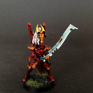
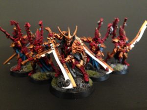
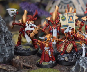
Once 8th edition dropped I started on a repainting journey. My primary drive was to give new love to my Drukhari who hadn’t gotten a lick of paint since 5th edition. I started with the model below the Klaivex.
Something about the paint job on this model was screamed to me that I had hit upon something I not done previously in my old paint jobs. It took awhile to realize it but it was the color balance.
While I’m certainly happy enough with the paint job on the squad above, you can see on that Archon that there are just so many colors fighting for your attention- and this was not what I wanted. The impression I wanted to give with my models is with red as the dominant color, Saim-Hann or Blood Angels style. Yet there is so much gold detailing in feels almost like a 50/50 split. Also the stark white of the blades, and the teal of the tabards and all of a sudden we’ve got way too many colors going on.
Actually let me revise the last statement. Its not there are too many colors, its that they are taking up too much space on the canvas and competing too heavily my reds.
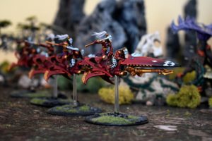
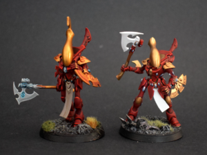
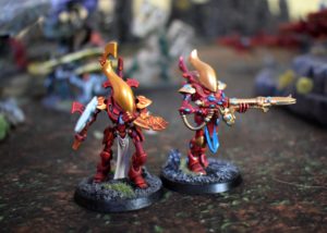
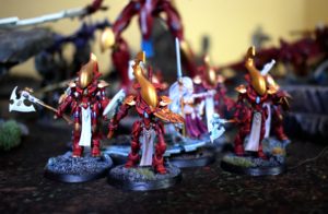
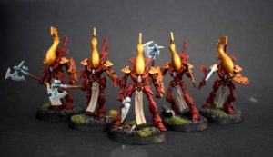
So recently I’ve been adding and repainting my old Wraithblades for a couple of Iyanden/Ynnari lists I’ve been working on and I found the contrast in styles worth examining to point out all the little things that can add up and subvert the impression you are trying to make visually.
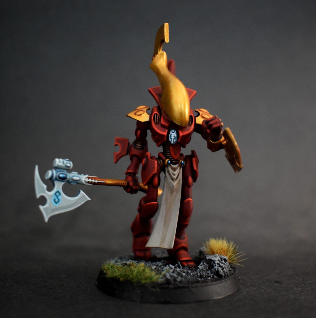
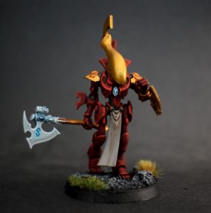
First off their is the unforgivable sin of not including the head crest, but besides that there are a lot of small things that really subvert the the bold, rich red scheme I’m going for.
1. The tone and number of gold elements. Its subtle but the gold I used was an old Testors paint (before GW produced Retributor) closer to Liberator which has a lot more silver in it, and just a far colder shade of gold than I wanted. Also even just the added element of doing the knee pads gold instead of red just takes away that bit more from the dominant red scheme.
2. The whites. On the old model the tabard and axe are a stark, pure white. With my new model the Rakarth Flesh of the tabard is a much more neutral color and the brown shading visually ties back in with the warm, reds a lot more. Also the axes are a pure white as opposed to the grey and the more attentive blending with the Nighthaunt Gloom ties it into the teal of the gems much more.
3. If you’ll notice I also dispensed with the painting every little node on their armor as a Spirit Stone. Jes Goodwin commented on that in an old White Dwarf and since finally gave myself permission to forgo the ALL THE SPIRIT STONES mentality I find that I really think it makes the models look better. There is better overall visual flow and you avoid a sort of blue leopard spots type look. Again it also keeps the canvas much, much warmer and makes those areas that do gets spirit stones, or magical glow look all the more special and eye catching because its only featured on the most prominent visual details.
Dont get me wrong, my Ghost Bois are all still seeing heavy rotation!
Conclusion
So while having to go back and do a million repaints is not the most fun thing in the world, especially when you are hard pressed for time with commissions, the approach I found is not only more visually pleasing its also easier to execute. I’m one of those guys who will avoid using certain units just because I’m dissatisfied with how they look, especially at the gaming store when people are checking out your models. Its always awkward saying “Dont look at this old crappy model, look at this new one!” So hopefully this article may have helped you identify some issues you may have with your own models, or helping you establish a color scheme for a new project you are under going.
If you are interested in Aeldari discussion check out our podcast: Splintermind for exclusive Drukhari and all things Aeldari news and discussion. We’ve got a great new episode coming soon for non-Patreons featuring Lawrence Baker from Tabletop Tactics and Wes from D6 Evolution coming up that features an in-depth breakdown of the new Ynnari highlighting all our favorite combinations and units. If you are interested in following my painting exploits check me out on Instagram! Thanks for reading and stay tuned!
And remember, Frontline Gaming sells gaming products at a discount, every day in their webcart!

Definitely an important area to consider. Especially, little touches like which off-white you’re using for the tabard and how that ties in or contrasts with your main colour(s)* can make a surprisingly big difference. I remember that comment from Jes, too, about how not all of the bumps are gems, many of them contain sensors or systems that are part of the armour or whatever other kinds of worky bits** the Model in question might need.
*The more main colours, the harder it is to get everything to balance. One is easiest, two is usually pretty manageable, three or more starts getting complicated. I know you know this, Cavalier, but I thought it was worth explicitly bringing it into the conversation.
**Can you tell that I’ve collected/played Orks a lot more than Aeldar? 😉